A month or two ago I ran a cyberpunk RED campaign that I wrote myself. Over the past month or so I wanted to see if I could get my idea of the map into unreal engine 5.
Sidenote: I realized it would have made more sense to learn cyberpunk 2077 mapping for this project. However since cyberpunk 2077 part 2 will be using unreal 5 (https://www.pcgamer.com/cyberpunk-2077-director-says-studios-switch-from-redengine-to-unreal-engine-5-isnt-starting-from-scratch/) by the time I get something that looks good maybe it will be ready to pull into a sequel?
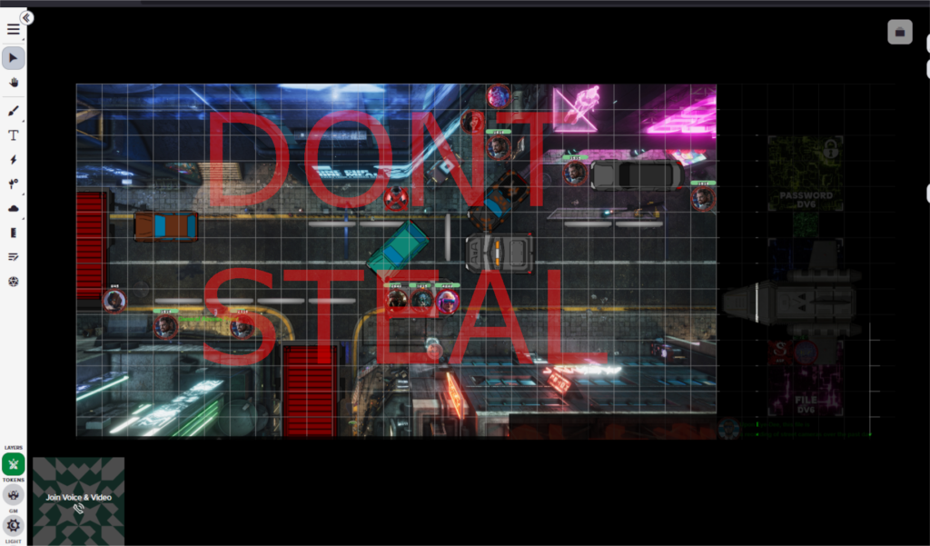
The original maps were made by cybermaps: https://www.patreon.com/cybermaps/posts (Subscribe to them, all the maps are great)
From the game I had 3 critical areas: The sewer, the night club and the apartment building. The goal for players was to head into the apartment building to find an npc that stole from the fixer that setup the job.
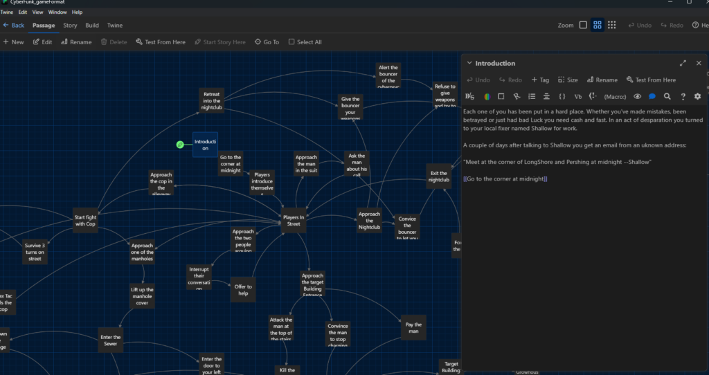
I also used twine to setup the story and prep for branching paths for the players. When I work on chapter 2 I’ll do a post on my process there (Also getting the data here pulled into unreal would be cool).
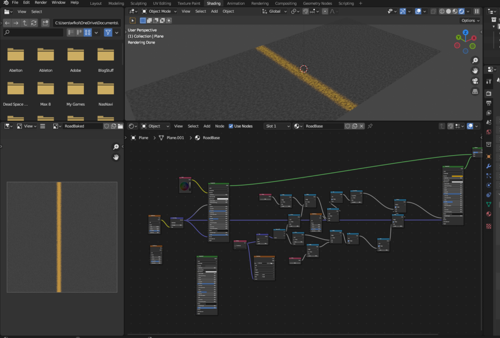
Greyboxing in unreal is pretty simple but like everything else more effort in == more quality out (when operating below the 80% mark like everything I do).
Here’s the working version:
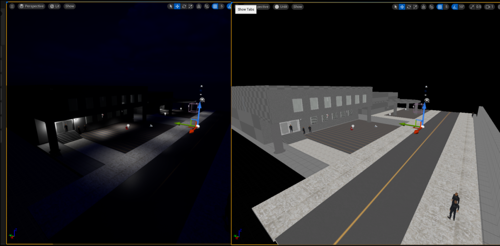
Not great, but hey it’s a start. I put in lighting before adding any light source models just to make sure I don’t make any huge errors in geometry. Then I took a mixmo model and had them as npc placeholders across the map. That weird road texture is actually made procedural in blender (which I think is more of a admission of guilt rather than a flex).
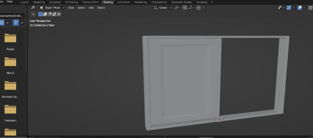
The first thing I wanted to make look kinda nice are the doors. I had a few mock ups before the doors in there now but I’m honestly not too much of a fan. The front doors to the apartment just straight crap rn, the texturing was a rush job and the doors themselves are kinda silly.
The double doors will be the player’s entry to the map so I think I’ll need special attention with those. However the interior doors seemed more manageable. I’ve gone through three iterations of interior doors:
Iteration 1:
I swore I had a first iteration here but I definitely saved over the first iteration with the 2nd iteration. If blender had a better style of source control (I could use git lfs but comeon) this could fix this issue. Future hopes is that blender gets a good internal usage of git/svn whatever so when I hit “save” it keeps a revision list like fusion 360.
Iteration 2:
This door was very rushed, you can see the scale is all off in the xy, the door is just a magic square the moves left to right. No indication of how the door works. Functionally this was nice for getting door sizes right but the greybox of the door has no shadowing so it’s actually really hard to see the window edge in bright light. The textures here I just spun up in unreal quickly and aren’t worth showing.
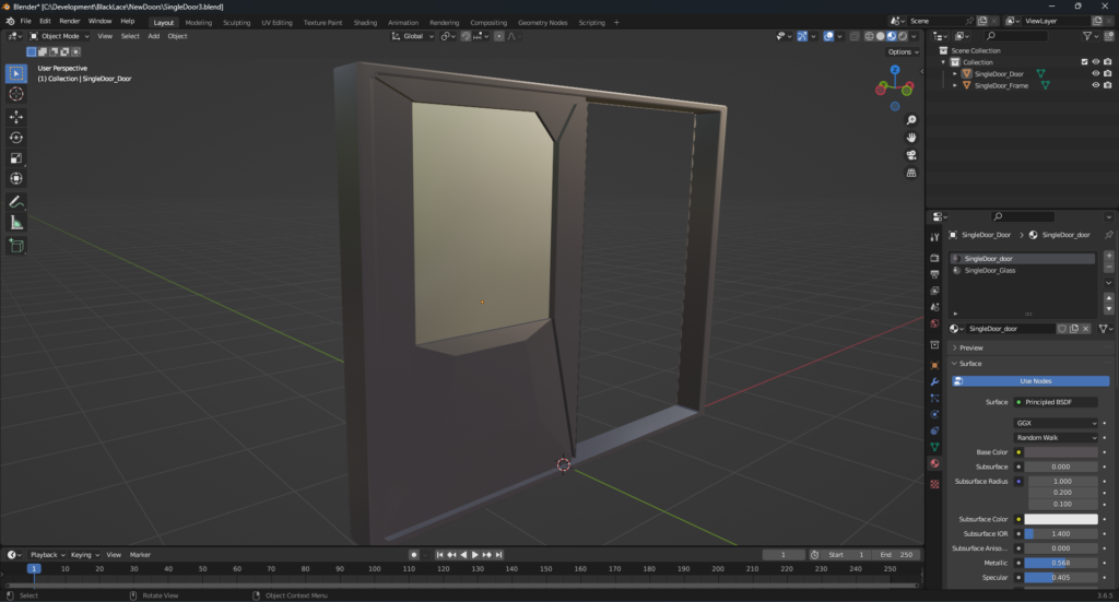
Iteration 3:
With iteration 3 I went hard into the “make sure someone could guess how this worked” which backfired imo.
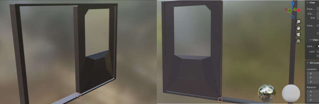
You can see this huge bulge in the back where I thought the majority of mechanics would be held. On the front there’s a smaller budge which I think has the whole engineering method of “Oh shit we need more room” built into it. I took this door and threw it into substance to add some details
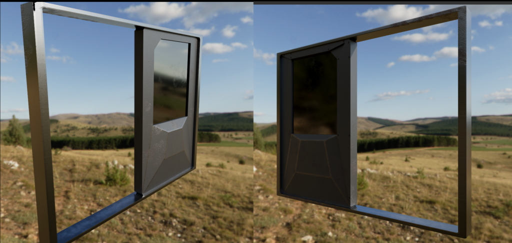
Honestly not the worst thing. It looks pretty cool with this lighting, so I dumped it into unreal to take a look.
Wow that took a turn for the worst. I’m not 100% sure how this happened, but at the moment everything looks like a cartoon, rather than the nice shiny metal from substance.
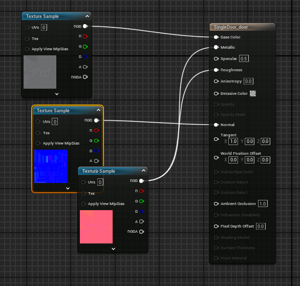
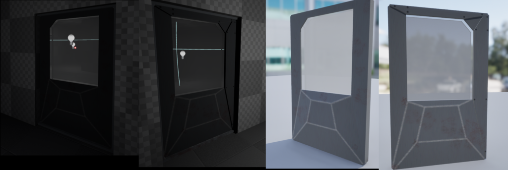
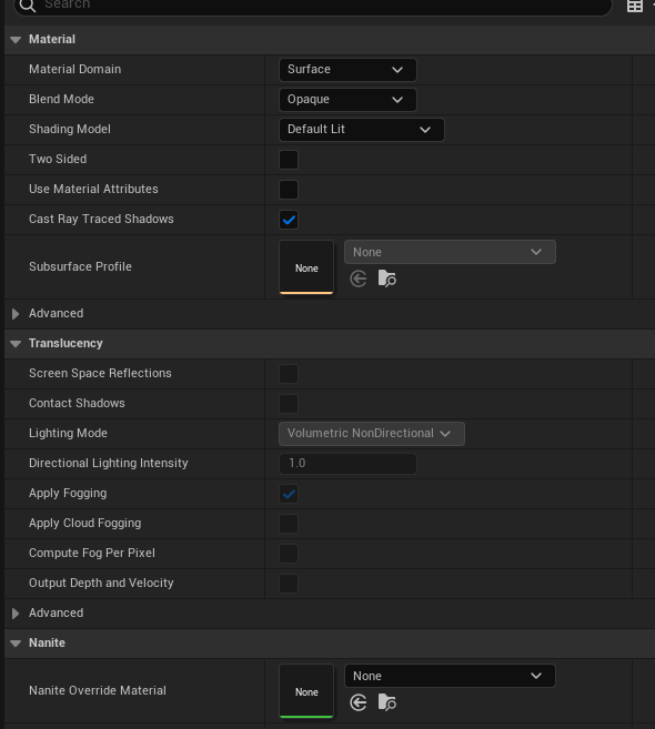
My thought is that the material type I’m using is probably not the correct type. I’m using a simple opaque texture but I gotta feeling because I was messing with the glass pbr shading in substance there’s an unreal equivalent.
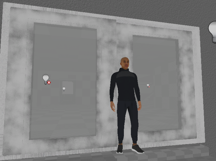
But regardless of the door shading/texturing the real problem starts to become more evident when you get in game:
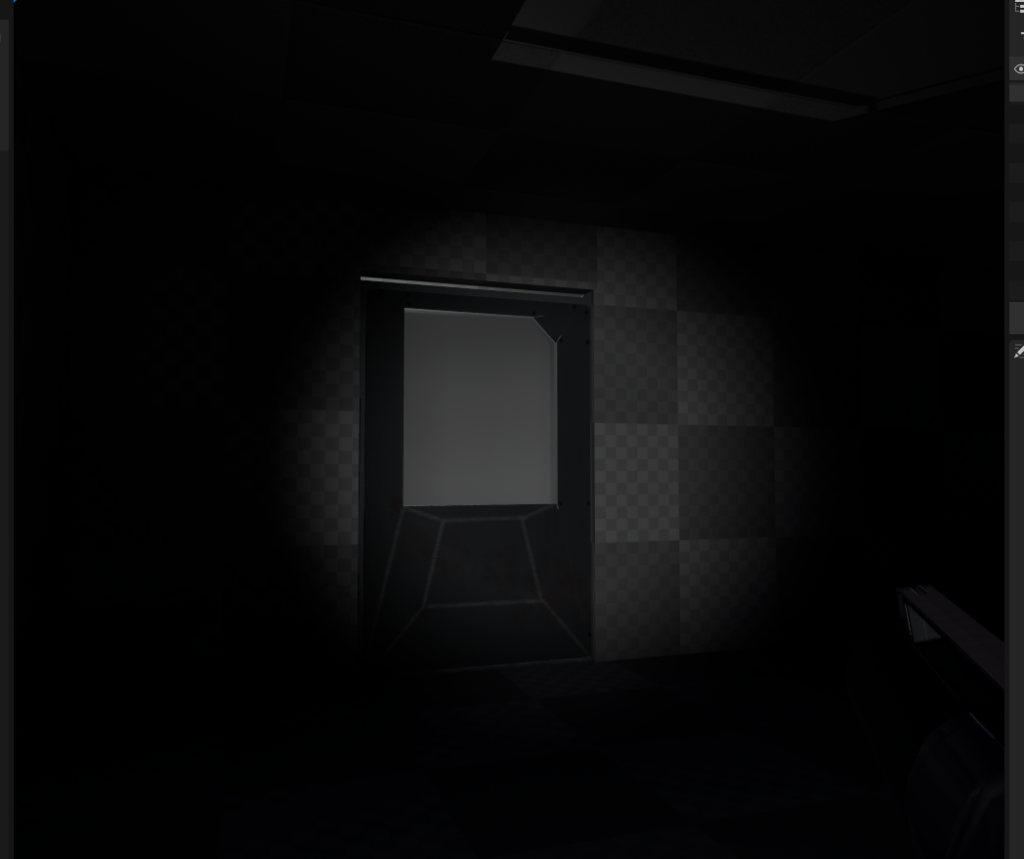
That’s a stright up jarring door to come up to. It looks like the hull of a spaceship with a huge window, both of which make no sense combined together. You figure you would either have a thin door with a pretty window or just a solid hunk of metal. Plus the goal of this building is to make it look like a rundown-ed future apartment which is controlled by a drug dealing gang. Why would they have freaking bulkheads for each apartment?
So back to the door drawing board I guess…