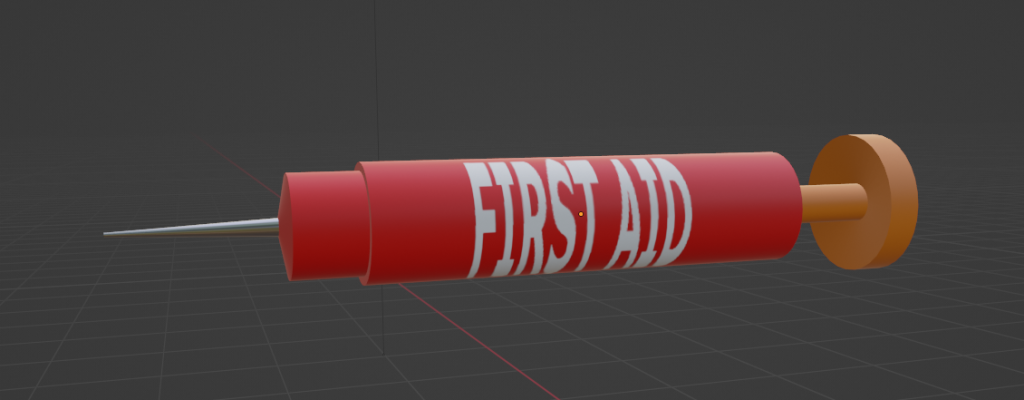
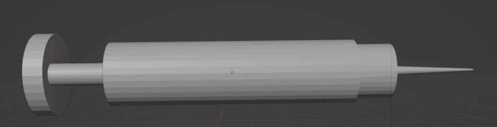
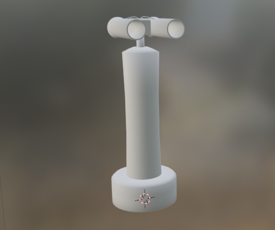
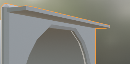
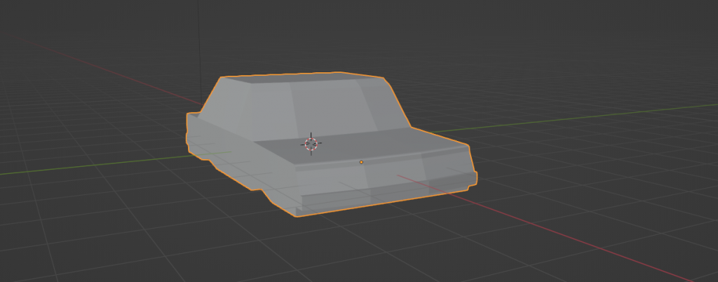
How the hell do I open these doors

Answer: A bunch of number keys and a non-de-script knob

Now I see how damn clean that scroll wheel guard is and I hate it…

Past week I spent time making a keypad for the doors in one of my previous posts. This guy took some doing: specifically because 1.) I didn’t know that grids in blender existed and 2.) the coloring on the keys made me anxious every-time I tried to make something.

Here’s the greybox:

I had a bunch of iterations here but the three main things were having a keypad, a indication LED and a screen. My hope is to hook this baby up to the doors i made previously to have a quick key code minigame thing in unreal.

By far the hardest part was making not the keypad keys but the plate that would go in between the keys and surround them. One of the biggest things I always try to prevent when using blender is having any issues with normals. Usually it’s hard to come by them if you model in a proper manner (which can be summarized to: always make quad faces.). However, in this case I thought I could use a boolean modifier to make the plate which turned out pretty bad:

With the keys
Without the keys

You can see here the whole face is messed up however in blender things were looking fine. I don’t have an image for what it looked like but basically it was the keyholes with a subtraction modifier then beveled. Here’s quick demo of what I did:

Step 1. make a bunch of cubes, add an x and z array modifier to each then apply.
Step 2: add a difference modifier to the plate mesh
Step 3, select all of the forward face, the ctrl+b and bevel that

Now there’s some disconnect because if you pull this into substance (I didn’t do this with the demo) all hell breaks loose and your normals are thrown into a rock tumbler to get that keypad image above.

However I got past it by using the now holy grid:

Praise be to the grid baby

Which is a bit more painful for inital creation because you have to line it up with your keys but once you do it’s just a quick insert faces, then delete command.

Pretty much that, assume there are perfect squares infront of each face, then I deleted each key face ans solidified + beveled

But anyways It seems to look fine in game:

The knob doesn’t have the notches I want, but I can easily make the screen look like it’s on with emissives:

Pretty cool, now I gotta hook it up and import the new doors to start fleshing out this building.

MoreDoor (modor?)

Took another crack at making a door today. This time around I focused on two things.

1.) Make the window smaller

2.) Use more normal mapping over geometry

Getting this setup in blender was much simpler this time around:

By avoiding details everything went by quicker in this stage. Only thing that took time was getting bevels right but really that’s like a 2 minute process. Once it was in substance I went crazy with some of the built-in normal modifiers. However it turned out much better than I expected.

I’m really digging the way the paint turned out, giving it that worn future painted feel. That being said the screws should probably have more wear on them, which I attempted to do but didn’t figure out how to add a mask paint layer until mid-writing this post.

Only issue right now is that the door feels barren and the handle seems out of place. I’m thinking I’ll try pulling it into unreal and adding decals dynamically (probably something like children’s drawings, posters, etc.). However that handle is a straight up eyesore. Also you can see the borders of the brush I used around the window:

I can go back and touch it up if I think it looks alright in unreal.

Doors

A month or two ago I ran a cyberpunk RED campaign that I wrote myself. Over the past month or so I wanted to see if I could get my idea of the map into unreal engine 5.

Sidenote: I realized it would have made more sense to learn cyberpunk 2077 mapping for this project. However since cyberpunk 2077 part 2 will be using unreal 5 (https://www.pcgamer.com/cyberpunk-2077-director-says-studios-switch-from-redengine-to-unreal-engine-5-isnt-starting-from-scratch/) by the time I get something that looks good maybe it will be ready to pull into a sequel?

The original maps were made by cybermaps: https://www.patreon.com/cybermaps/posts (Subscribe to them, all the maps are great)

From the game I had 3 critical areas: The sewer, the night club and the apartment building. The goal for players was to head into the apartment building to find an npc that stole from the fixer that setup the job.

I also used twine to setup the story and prep for branching paths for the players. When I work on chapter 2 I’ll do a post on my process there (Also getting the data here pulled into unreal would be cool).

Greyboxing in unreal is pretty simple but like everything else more effort in == more quality out (when operating below the 80% mark like everything I do).

Here’s the working version:

Left: Lit map, Right: unlit map

Not great, but hey it’s a start. I put in lighting before adding any light source models just to make sure I don’t make any huge errors in geometry. Then I took a mixmo model and had them as npc placeholders across the map. That weird road texture is actually made procedural in blender (which I think is more of a admission of guilt rather than a flex).

I could have made a image in photoshop/gimp or even substance and it would have been simpler….

The first thing I wanted to make look kinda nice are the doors. I had a few mock ups before the doors in there now but I’m honestly not too much of a fan. The front doors to the apartment just straight crap rn, the texturing was a rush job and the doors themselves are kinda silly.

The double doors will be the player’s entry to the map so I think I’ll need special attention with those. However the interior doors seemed more manageable. I’ve gone through three iterations of interior doors:

Iteration 1:

I swore I had a first iteration here but I definitely saved over the first iteration with the 2nd iteration. If blender had a better style of source control (I could use git lfs but comeon) this could fix this issue. Future hopes is that blender gets a good internal usage of git/svn whatever so when I hit “save” it keeps a revision list like fusion 360.

Iteration 2:

This door was very rushed, you can see the scale is all off in the xy, the door is just a magic square the moves left to right. No indication of how the door works. Functionally this was nice for getting door sizes right but the greybox of the door has no shadowing so it’s actually really hard to see the window edge in bright light. The textures here I just spun up in unreal quickly and aren’t worth showing.

Iteration 3:

With iteration 3 I went hard into the “make sure someone could guess how this worked” which backfired imo.

Left: Back, Right:Front

You can see this huge bulge in the back where I thought the majority of mechanics would be held. On the front there’s a smaller budge which I think has the whole engineering method of “Oh shit we need more room” built into it. I took this door and threw it into substance to add some details

Left: Back, Right: Front

Honestly not the worst thing. It looks pretty cool with this lighting, so I dumped it into unreal to take a look.

From left to right: Back in game lighting, front in game lighting, back in asset view lighting, right in asset view lighting

Wow that took a turn for the worst. I’m not 100% sure how this happened, but at the moment everything looks like a cartoon, rather than the nice shiny metal from substance.

My thought is that the material type I’m using is probably not the correct type. I’m using a simple opaque texture but I gotta feeling because I was messing with the glass pbr shading in substance there’s an unreal equivalent.

But regardless of the door shading/texturing the real problem starts to become more evident when you get in game:

That’s a stright up jarring door to come up to. It looks like the hull of a spaceship with a huge window, both of which make no sense combined together. You figure you would either have a thin door with a pretty window or just a solid hunk of metal. Plus the goal of this building is to make it look like a rundown-ed future apartment which is controlled by a drug dealing gang. Why would they have freaking bulkheads for each apartment?

So back to the door drawing board I guess…